How sad & geeky is this?
So, I noticed that my Firefox bookmark sidebar at work (XP) was using a much smaller font than my FF at home (Linux). And it was an ugly little font, too. It wasn't so bad when I was using a 1024x768 res, but with a 1280x1024. . .
So I went into the display manager and told it to use the next font size up. Which worked, but also reset my custom colour theme to the default - to cut down on glare, I've toned down the colours. The toolbars are dark grey, and the default background is a pale blue rather than glaring white. It's just easier on the eyes.
So, I had to get a bit more in-depth with the settings to turn it back to my desired colours. And I noticed a font option - use "ClearType" instead of "Standard".
Hmm. . .
So I switch to Clear Type, and suddenly. . . all my fonts go anti-aliased! All the annoying grainy-ness vanished into smooth curves.
So: Just how much of a geek do you have to be in order to derive pleasure from the fact that you can now use anti-aliased fonts on your XP workstation?
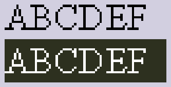
(If you're not enough of a geek to understand the difference, allow me to clarify: Non-aliased fonts are just plain black & white, so tend to appear pixellated when you have angles and curves:


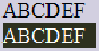
while anti-aliased fonts use mixed shades to make the fonts look much smoother and less grainy:


I think you can probably appreciate the difference from these comparisons. You can also see the shade of blue-purple that I use instead of white as my default background :o)


1 Comments:
It's not geeky, I think. I just tried this and get a little bit shocked - is it better now or not? Is it better for the eyes or is it more blur?
So I'm testing it for the time to come.
Thank you for the tip - just went there because of a linux blog and found some XP tip - same at me, XP at work, Linux at home :-)
Oliver
Post a Comment
<< Home