More on boosting blog traffic
Courtesy of another link from the creative hedgehog blog, just a couple of comments on the HOW TO: Boost Your Blog Traffic post.
Won't be nearly as exhaustive as the earlier one, as I mostly agree with it. Just a couple of points:
Most web users are instantly turned off by tacky site designs or extreme neon colors
Ahh, how well I remember my first ever web page. . . it had a rippled-blue background, yellow text, vast numbers of cartoon images (Largely Calvin & Hobbes, IIRC), red balls alongside each link. . .
And when Netscape 2.0 came out in Beta! Wow, what a time that was. The exhilaration of putting animated gifs on the page, and having a scrolling Java message at the bottom of your browser. All-singing, all-dancing, and ye Gods did it make your eyes water when you tried to read anything.
Over time, my various pages evolved into much simpler formats, until they've arrived at today's plain black & white with the odd graphic.
Take this piece of advice to heart: Just because you can use some funky new feature/graphic/whatever, doesn't mean you should.
If you post guides or reviews on your blog that you think many people can benefit or learn from, I suggest posting a link on del.icio.us or Digg. If your page gets on the frontpage of Digg or on del.icio.us popular, you're set.
You know, I'd never heard of digg.com until last month. del.icio.us I knew, but not as something I was really interested in. I still don't actually visit either site as a regular - doesn't interest me, somehow.
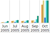
However, last month, my Linux != Windows page was posted on digg.com, and it went to the front page. Following which, it also made it into del.icio.us/popular. If you wonder what sort of difference it really makes, having your page/blog reach such heady levels of success this graph may well answer you:

October was indeed a busy month - over ninety-two thousand hits from over fifteen thousand unique visitors. Quite a leap from September's 14,000 hits from 1700 visitors, eh?
Just some food for thought. . .
Won't be nearly as exhaustive as the earlier one, as I mostly agree with it. Just a couple of points:
Most web users are instantly turned off by tacky site designs or extreme neon colors
Ahh, how well I remember my first ever web page. . . it had a rippled-blue background, yellow text, vast numbers of cartoon images (Largely Calvin & Hobbes, IIRC), red balls alongside each link. . .
And when Netscape 2.0 came out in Beta! Wow, what a time that was. The exhilaration of putting animated gifs on the page, and having a scrolling Java message at the bottom of your browser. All-singing, all-dancing, and ye Gods did it make your eyes water when you tried to read anything.
Over time, my various pages evolved into much simpler formats, until they've arrived at today's plain black & white with the odd graphic.
Take this piece of advice to heart: Just because you can use some funky new feature/graphic/whatever, doesn't mean you should.
If you post guides or reviews on your blog that you think many people can benefit or learn from, I suggest posting a link on del.icio.us or Digg. If your page gets on the frontpage of Digg or on del.icio.us popular, you're set.
You know, I'd never heard of digg.com until last month. del.icio.us I knew, but not as something I was really interested in. I still don't actually visit either site as a regular - doesn't interest me, somehow.
However, last month, my Linux != Windows page was posted on digg.com, and it went to the front page. Following which, it also made it into del.icio.us/popular. If you wonder what sort of difference it really makes, having your page/blog reach such heady levels of success this graph may well answer you:

October was indeed a busy month - over ninety-two thousand hits from over fifteen thousand unique visitors. Quite a leap from September's 14,000 hits from 1700 visitors, eh?
Just some food for thought. . .


0 Comments:
Post a Comment
<< Home